Gousto
A case study
THE PROJECT:
As part of an assignment for my graphic design degree, I had to select an existing company and rebrand it.
THE COMPANY:
I chose Gousto, a sustainability focused, fresh-food delivery company headquartered in England. The firm provides seasonal, quality products to its customers. To maintain sustainability, the quantities of ingredients are precisely measured to avoid any waste. I decided to rebrand Gousto because I believe their visual identity is not representative of these sustainable objectives.
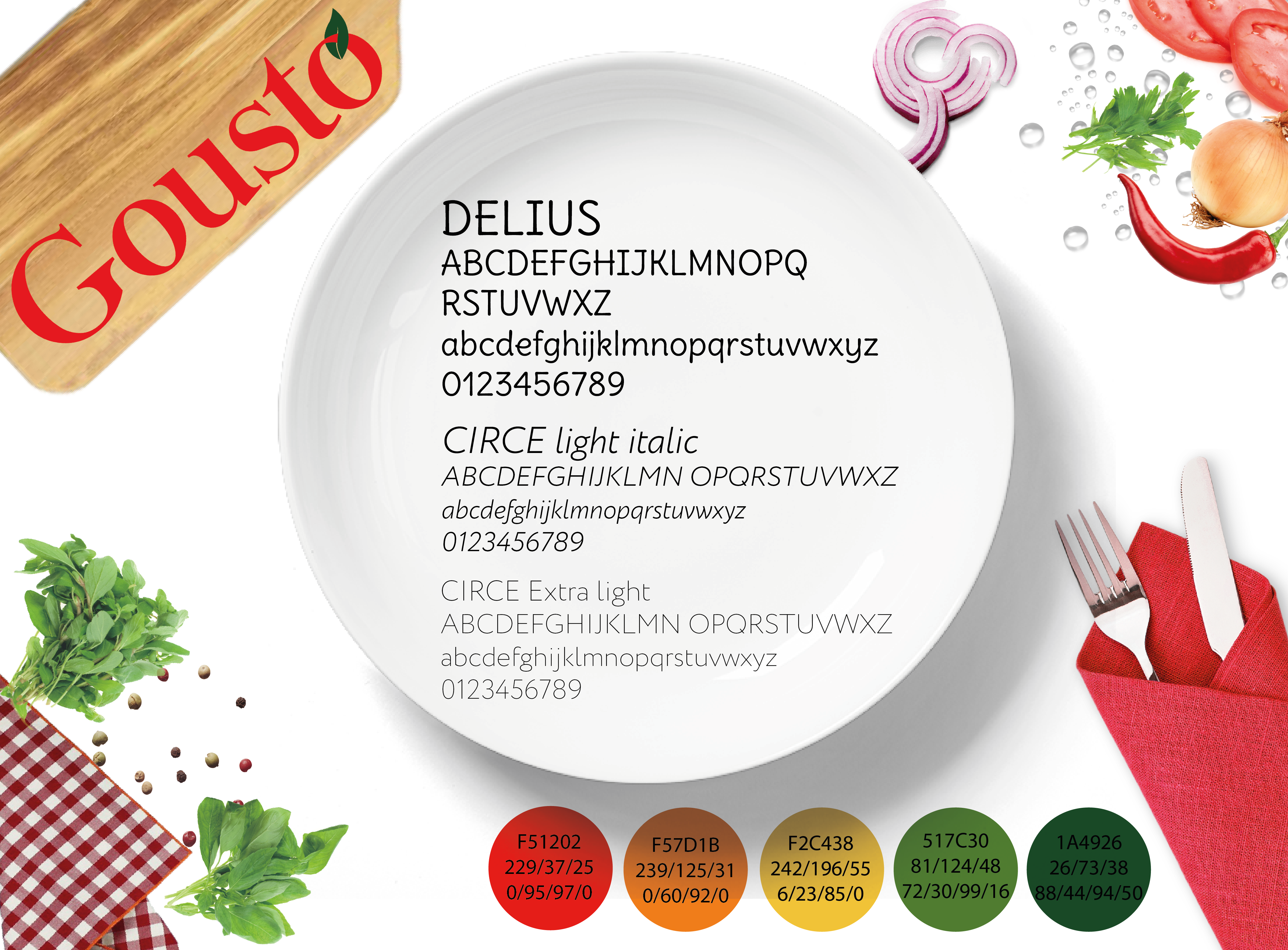
I decided to keep red as the primary color because in the food industry red is known to trigger appetite. However, I added green as the secondary color to associate the brand with the ideas of natural, fresh, and healthy ingredients. I also selected a more traditional font to match Gousto’s view on cooking.
THE ONLINESS STATEMENT:
I had to create a concept that would differentiate Gousto from other sustainable food companies. To avoid pollution, the firm already provides craft packaging. I believe Gousto could push this concept even more by giving their customers the opportunity to return their waste. The company will then oversee recycling this waste, which will create a fully sustainable waste management.
Gusto is the only food delivery company that allows their customers to send their food waste to be recycled by the firm.
THE MOOD BOARD:
I made this mood board as a guide for the visual identity of the brand.


